Most “cookie banner examples” roundups online are years out of date, built before regulators started enforcing reject-all parity, and full of banners that would fail a basic GDPR or CPRA review today. This one is not that. Every banner below was captured directly from the live site, and every entry explains the specific design choice that makes it work: not just “this looks nice,” but why the layout, copy, or button hierarchy helps the banner get answered instead of ignored.
That distinction matters because a cookie banner has exactly one job most owners get wrong: it has to make saying no exactly as easy as saying yes, without making so little effort at persuasion that everyone reflexively rejects everything. Sites that get this right tend to share a small set of habits, not a single template. This roundup groups 30 of them by the pattern they use, so the choice in front of you is “which pattern fits my site,” not “which single banner do I copy.”
What Makes a Cookie Banner Convert in 2026
A handful of traits show up again and again in the banners below:
- Reject is one click, not three. A visible “Reject All” or “Decline” button next to “Accept All,” not buried inside a settings panel.
- The copy explains the trade, not the law. Users respond to “so we can remember your cart” better than a paragraph of legal boilerplate.
- Category toggles are pre-set to off, not pre-checked, so consent is opt-in rather than opt-out dressed up as a choice.
- The banner matches the brand, not the CMP vendor’s default theme, so it reads as part of the site rather than an interruption bolted on top.
- It gets out of the way fast once a choice is made, with no second confirmation screen for simple accept/reject decisions.
Keep these five in mind while reading through the examples. Where a banner breaks one of them anyway and still works, the entry below says so.
Low-Friction Minimalists
These sites keep the decision small: a short bar or panel anchored to the bottom of the screen for most of them, or, in one case below, a compact modal with nothing beyond three clearly labeled buttons. What they share is restraint. No lengthy toggle list stands between the visitor and a choice, so people engage with it on their own schedule instead of under pressure.
1. IKEA
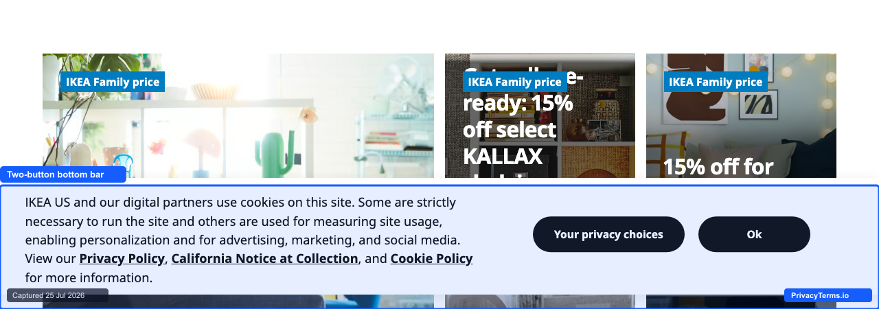
IKEA's two-button bottom-bar cookie banner
IKEA runs a plain white bar with two clearly weighted buttons, “Your Privacy Choices” and “Ok,” and names California’s notice-at-collection rules directly alongside its Privacy Policy and Cookie Policy links. That explicit CCPA reference, not just a generic GDPR-style disclosure, is a detail worth copying for any US-facing retailer: it signals the banner was built for the visitor’s actual jurisdiction rather than a one-size-fits-all template.
2. LEGO
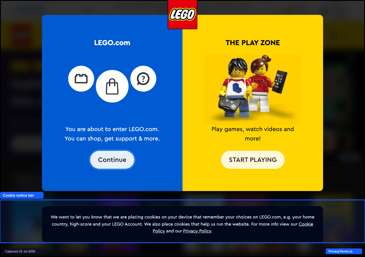
LEGO's cookie notice bar, stacked beneath an unrelated region-selection modal
LEGO’s cookie notice is a plain black bar naming exactly what the cookies remember (home country, high scores, account) with links to its Cookie Policy and Privacy Policy, but it renders stacked underneath a separate, unrelated region and audience picker modal on first visit. Two overlays competing for attention on the same load is the pattern to avoid here: the cookie notice itself is clear, but a visitor has to clear one prompt to even notice the second one exists.
3. The Guardian
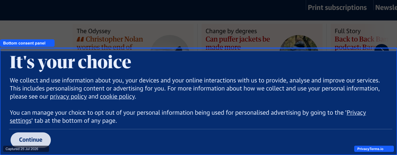
The Guardian's bottom consent panel, titled "It's your choice"
The Guardian’s version is less a thin bar than a full-width bottom panel, titled “It’s your choice,” that explains in two short paragraphs what data gets used and how to change the decision later through a “Privacy settings” tab. It only offers “Continue” in the immediately visible area rather than a same-weight reject button, which is worth noting as a gap next to IKEA’s example above: explaining the choice clearly is not the same as making both options equally reachable.
4. Spotify
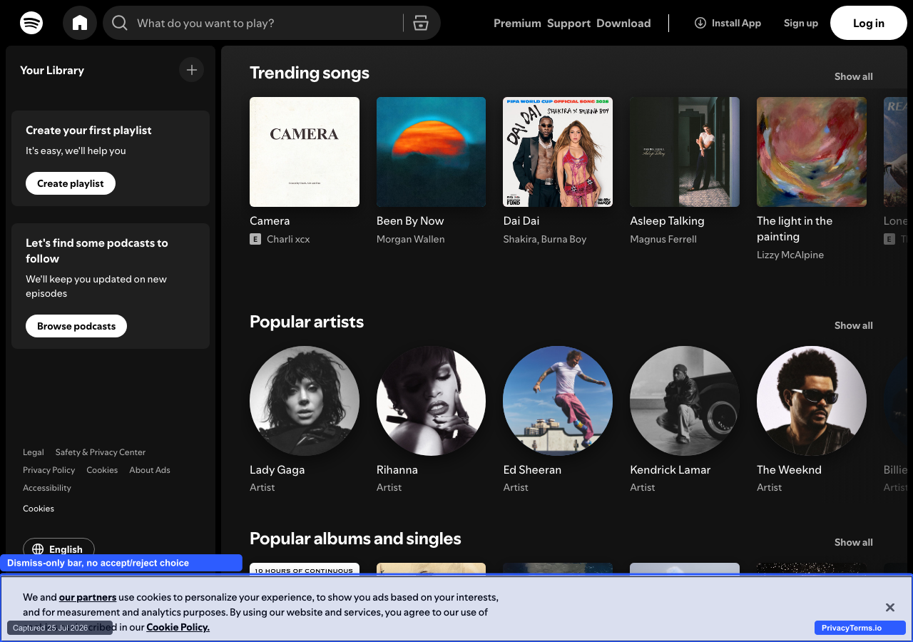
Spotify’s dismiss-only cookie banner, with no accept/reject choice shown
Spotify’s current banner is close to the minimum viable version: a single sentence naming “our partners,” a link to its Cookie Policy, and an X to dismiss, with no visible Accept or Reject button in this view. It is a useful counterexample as much as a good one: dismissing is not the same as recording a consent choice, and a banner this bare is easy to build but leaves it unclear what closing it actually agreed to.
5. Ryanair
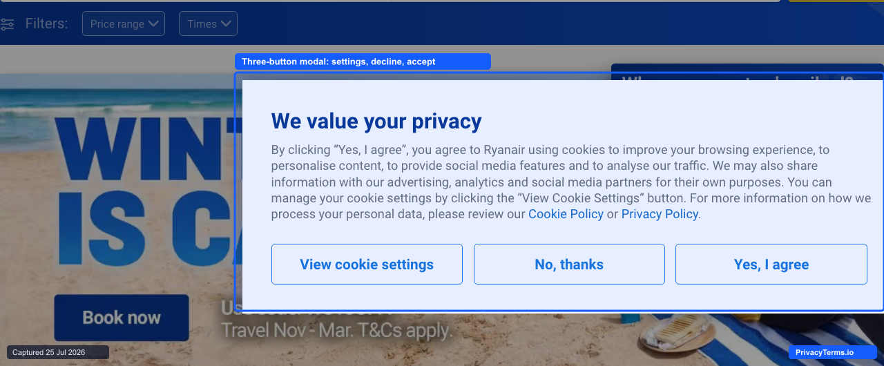
Ryanair's three-button cookie consent modal: settings, decline, accept
Ryanair’s modal names exactly what it is for (“We value your privacy”) and gives three genuinely equal-weight buttons: “View cookie settings,” “No, thanks,” and “Yes, I agree,” styled with the same outline treatment so none visually dominates the others. For a company whose booking flow already asks visitors to make fast decisions under promotional pressure (countdown offers, limited seats), keeping the consent choice itself free of that same pressure is a deliberate, and correct, contrast.
Center-Modal Detail-Firsts
Rather than a thin bar, these sites open a centered modal that shows category toggles immediately, on the theory that users who are going to engage with a banner at all would rather choose once than click through two screens.
6. MediaMarkt
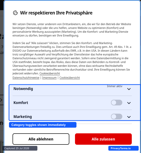
MediaMarkt's centered modal with necessary, comfort, and marketing toggles
MediaMarkt’s modal opens with all three consent categories visible as toggles (Notwendig, locked on; Komfort and Marketing, both off by default) rather than tucking them behind a “manage preferences” click, and it pairs each category with a plain description of what it covers directly above the switches. The modal also spells out, in the first paragraph, what accepting actually means for cross-border data transfer under GDPR Article 49, a level of legal specificity most retailers push into a linked policy instead of the banner itself.
7. Vodafone
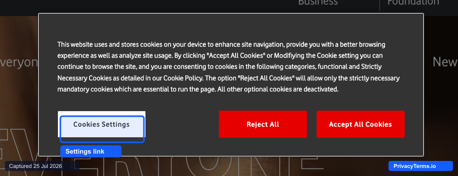
Vodafone's centered cookie consent modal, with a Cookies Settings button next to equally-weighted Reject and Accept options
Vodafone’s modal centers on load with one dense paragraph naming its functional and strictly-necessary categories, then hands off anything more granular to a separate “Cookies Settings” button instead of listing toggles on the first screen, the opposite move from HubSpot and LinkedIn below it in this section. What is worth copying regardless is the button weighting: “Reject All” and “Accept All Cookies” are styled in the identical red fill and size, so neither option visually outranks the other, while “Cookies Settings” gets its own outlined treatment that marks it clearly as the secondary path rather than hiding it in body text.
8. Philips
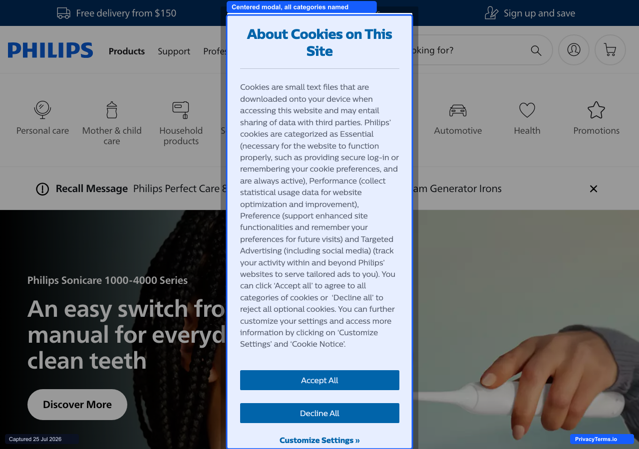
Philips' cookie consent modal naming all four cookie categories in the first screen
Philips skips toggle switches on the first screen and instead writes out all four cookie categories, Essential, Performance, Preference, and Targeted Advertising, directly inside the modal’s opening paragraph, describing in one clause what each one actually does before any button appears. It is a heavier read than the toggle-row layout most of this section uses, but it means a visitor who clicks straight to “Accept All” or “Decline All” without opening “Customize Settings” still saw what those categories cover, rather than skipping past unlabeled switches. For a company selling consumer electronics across dozens of national storefronts with different disclosure requirements, spelling out every category in plain text is a simpler thing to localize correctly than a toggle interface with four separate labels and descriptions.
9. Deutsche Bahn
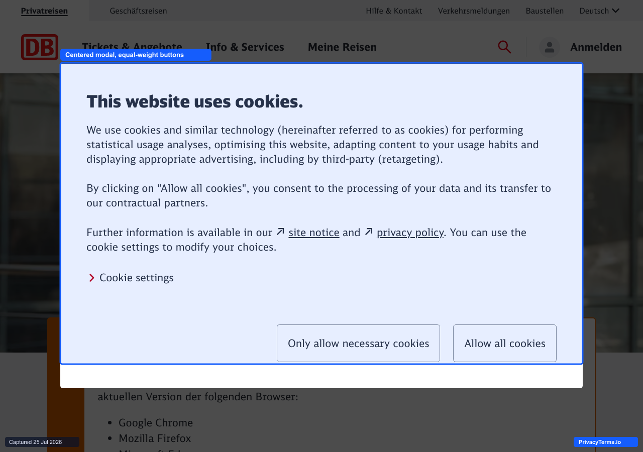
Deutsche Bahn's centered modal, with an expandable "Cookie settings" link above two equal-weight buttons
Deutsche Bahn’s modal states its purposes in three short paragraphs, statistical analysis, site optimization, and third-party retargeting, before offering a “Cookie settings” link for anyone who wants the category-by-category view instead of reading through the summary. “Only allow necessary cookies” and “Allow all cookies” sit side by side as identically sized outline buttons, so neither reads as the intended default. Naming retargeting specifically, rather than folding it into a generic “advertising” bucket, is a level of honesty most modals in this section leave out.
10. Novo Nordisk
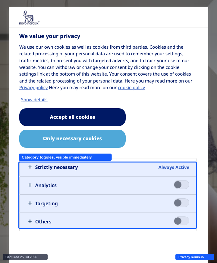
Novo Nordisk's centered cookie consent modal with toggles visible on the first screen
Novo Nordisk’s modal shows all three optional categories, analytics, targeting, and others, each with its own off-by-default toggle, directly beneath the accept and reject buttons rather than behind a “Manage Preferences” click. A “Show details” link expands per-category descriptions in place instead of opening a separate screen, and “Strictly necessary” is marked “Always Active” so visitors can see at a glance which cookies aren’t optional. For a pharmaceutical company operating across dozens of national data-protection regimes, keeping the full toggle set on the first screen removes any ambiguity about what a quick “Accept all” click actually authorizes.
Slide-In Corner Widgets
A non-blocking widget appears in a bottom corner rather than spanning the full width of the screen. It signals lower urgency than a bar or modal, which suits products where interrupting the primary task costs more than a slightly lower response rate.
11. Babbel
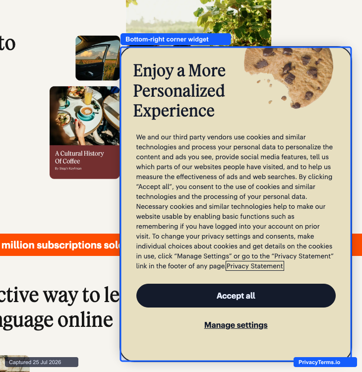
Babbel's bottom-right corner widget cookie banner, illustrated with a cookie graphic
Babbel’s widget sits in the bottom-right corner as a self-contained card rather than spanning the page, leaving the language-selection grid and lesson content behind it fully visible and clickable. The literal cookie illustration is a small, effective touch that ties the visual to the legal concept it is asking about, but the button hierarchy is worth flagging: “Accept all” is a solid black button, while the only other option, “Manage settings,” is a plain text link with no equal-weight “Reject all” next to it.
12. Figma
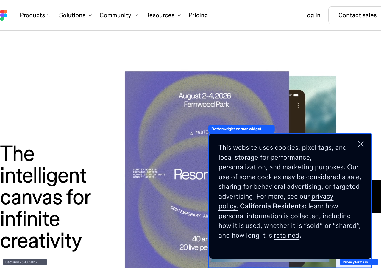
Figma's compact bottom-right corner cookie consent widget
Figma’s widget stays anchored to the bottom-right corner rather than spanning the page, roughly a third of the viewport wide, and leads with plain disclosure language before folding California-specific rights (“sold or shared,” “collected,” “retained”) directly into the same paragraph instead of a separate CA-only notice. There is no same-screen Accept/Reject pair in the initial view, only a close control, which puts it in the same minimal-action camp as Spotify’s banner earlier in this list: informative rather than an explicit choice captured on click. For a design tool whose own product competes on staying out of the way while people work, keeping the notice small and corner-anchored instead of a page-covering takeover matches the same restraint the product sells.
13. Webflow
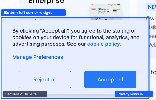
Webflow's bottom-left corner cookie consent widget
Webflow’s widget stays anchored to the bottom-left corner at well under half the screen width, sitting beside the homepage’s own feature cards instead of covering them, which matters on a page this dense with scrolling content. The copy is a single sentence naming the storage purpose, a linked cookie policy, and a “Manage Preferences” toggle for anyone who wants categories instead of a binary choice. The two decision buttons are sized identically, but “Accept all” is filled solid blue while “Reject all” stays outlined, so the pattern’s restraint on placement does not fully carry over to button weight, a detail worth flagging for a company that otherwise sells design polish as a core feature.
14. Mailchimp
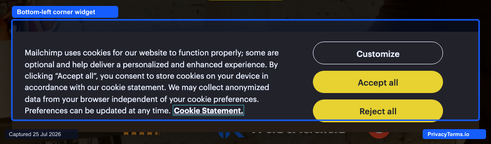
Mailchimp's bottom-left corner widget, built on a OneTrust implementation
Mailchimp anchors its widget to the bottom-left corner rather than spanning the viewport, but unlike the pared-down widgets elsewhere in this section it keeps a full explanatory paragraph and three equal-weight buttons, “Customize,” “Accept all,” and “Reject all,” all visible without opening a second panel. That makes it a useful middle case for this section: a corner widget does not have to shrink to one line and two buttons to stay non-blocking, as long as the layout keeps “Customize” and “Reject all” exactly as reachable as “Accept all.”
15. Miro

Miro's bottom bar, titled "Cookies, anyone?," with Reject All set as a plain text link next to two boxed buttons
Miro’s bar is worth including here as the exception rather than the rule: it is a full-width bottom bar, not a corner widget, but it shares this section’s minimal, low-blocking footprint and is a clean example of the pattern’s most common failure. “Cookies Settings” and “Accept All Cookies” are styled as identical boxed buttons, while “Reject All” is demoted to plain underlined text off to the side, quietly costing the decline option the visual weight the other two options get. The playful heading (“Cookies, anyone?”) does not carry through to the button hierarchy underneath it.
Granular Preference-Center-Firsts
Instead of a quick accept/reject choice, these sites open straight into a full preference center with named vendor categories. This pattern suits publishers and marketplaces running many third-party trackers, where a simple binary choice would understate how much data actually changes hands.
16. The New York Times
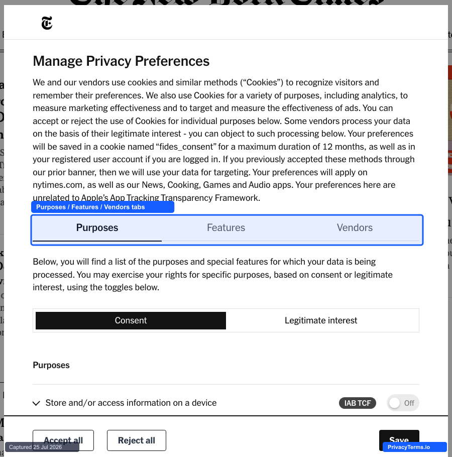
The New York Times' IAB TCF preference center, opened from a "Manage preferences" link on its initial consent bar
The Times’ first screen is a compact three-button bar (Accept all, Reject all, Manage preferences) that already discloses 336 vendors, and clicking through to “Manage preferences” opens a full IAB Transparency and Consent Framework center with separate Purposes, Features, and Vendors tabs. Inside, each purpose carries its own toggle between consent-based processing and a vendor’s “legitimate interest” claim, a distinction most banners never surface even though legitimate-interest processing can continue after a visitor rejects the consent-based option. It takes one extra click to reach compared to the other entries in this section, but once opened it is the most granular preference center in this roundup, which fits a publisher whose ad business runs on hundreds of named vendors rather than a single generic “advertising” bucket.
17. Euronews
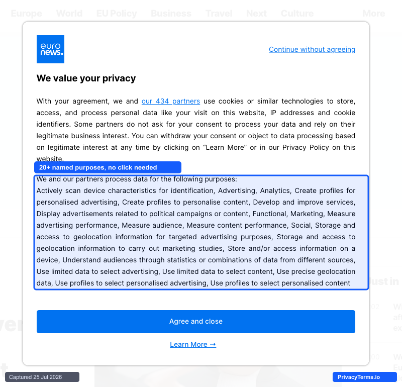
Euronews' cookie consent modal listing 20+ named data-processing purposes directly
Euronews’ modal skips a simplified accept/reject screen entirely and opens straight into a full list of what its “434 partners” actually do with visitor data, spelled out purpose by purpose, from “create profiles for personalised advertising” to “store and access geolocation information for targeted advertising purposes,” with a “Learn More” link to the underlying per-vendor list for anyone who wants to go further. For a pan-European broadcaster whose ad business runs on exactly that kind of partner network, showing the full scope of processing before asking for agreement is a more honest default than most publishers ship, even if the resulting wall of text asks more of a skimming visitor than a four-category summary would.
18. eBay
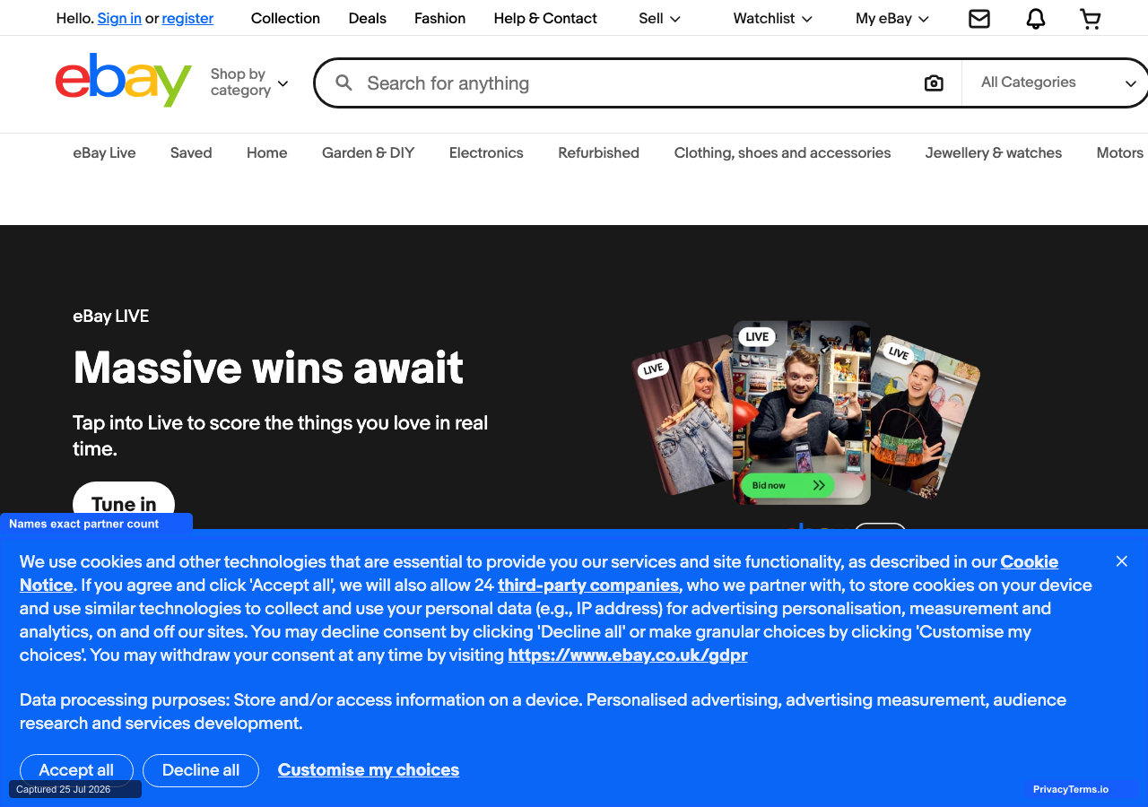
eBay's cookie banner naming its exact third-party partner count
eBay’s banner states the precise number of outside companies involved before a visitor decides anything: accepting means allowing “24 third-party companies” to store cookies for advertising and measurement, with a direct link to see who they are. That specific count, refreshed as the partner list changes, is a more honest disclosure than the generic “trusted partners” wording most marketplace banners default to, which matters for a platform where a meaningful share of tracking comes from listings and sellers outside eBay itself. A dedicated “Customise my choices” link sits at the same visual weight as “Accept all” and “Decline all,” so reaching the full preference center never costs more than the one click either primary option does.
19. Rightmove
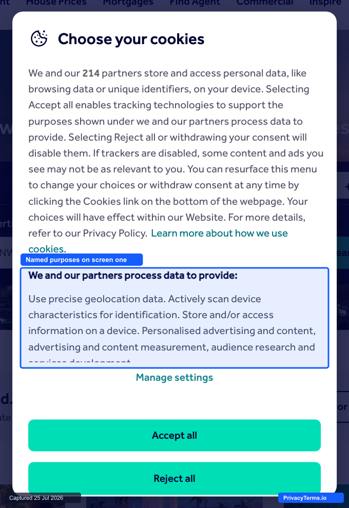
Rightmove's cookie preference center naming specific data-use purposes
Rightmove’s modal states the number of partners involved (“214”) and lists what they actually do with data (precise geolocation, device scanning for identification, personalized advertising and content measurement) directly on the first screen, rather than behind a “Manage Preferences” click. “Manage settings” is offered as a secondary path, but “Accept all” and “Reject all” sit as equal-weight buttons for visitors who came in already knowing their answer. For a property marketplace built on hundreds of ad and analytics integrations, naming the purposes instead of hiding them behind a summary line gives visitors a materially more accurate picture of what “Accept all” actually authorizes.
20. POLITICO Europe
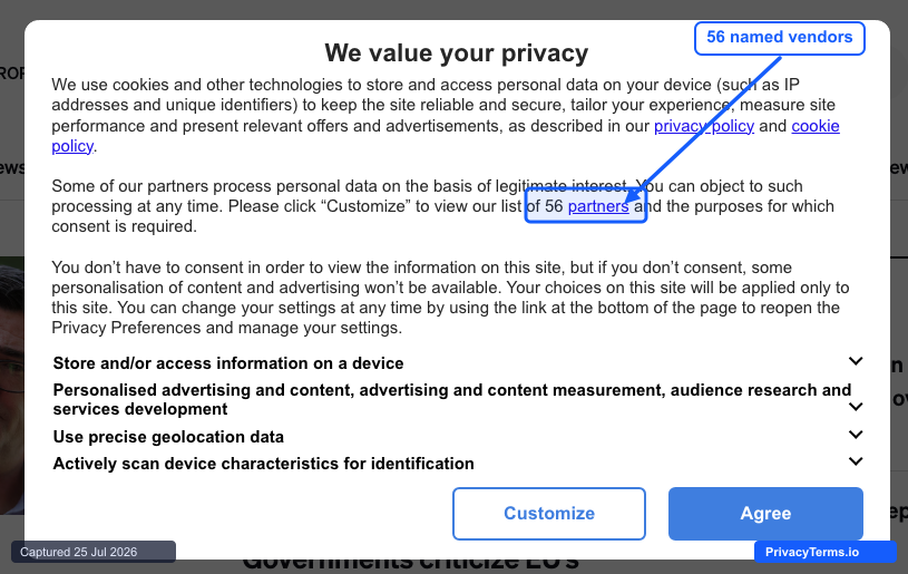
POLITICO Europe's IAB TCF consent modal naming its 56-partner vendor list
POLITICO Europe’s modal names an exact count, “our list of 56 partners,” with a direct link to the vendor list itself rather than a vague reference to “advertising partners,” and breaks consent into four specific purposes, including “actively scan device characteristics for identification,” a plainly worded admission of device fingerprinting most CMPs bury in legal language. That specificity fits a readership of policy and compliance professionals who are more likely than average to click through and check exactly who is on the list, and it is a more candid disclosure than the categorized-but-unnamed approach used by most publishers in this roundup.
Brand-Styled Bars With Strong CTA Hierarchy
These sites use a full-width bar (top or bottom) but distinguish themselves through unusually deliberate visual hierarchy between the accept and reject actions, rather than relying on a minimalist or granular structure to do the work.
21. Puma

Puma's bottom cookie bar, with one bold "I agree" button and no equal-weight reject option
Puma runs a full-width black bar with a short two-sentence explanation and a single tan “I agree” button styled with the same bold, high-contrast treatment as the “Shop Now” button in the hero above it, so the CTA reads as part of the core site rather than a bolted-on vendor widget. The catch is the hierarchy only runs one direction: the only alternative to accepting is a plain inline text link (“Click here for more information”), not a same-weight reject or decline button. It’s a useful example of the pattern’s upside and its most common failure mode in the same shot: strong, on-brand visual weight on the accept action, with no equivalent weight given to saying no.
22. The Body Shop
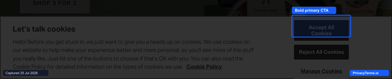
The Body Shop's bottom bar with a bold-weight Accept button next to a muted Reject button
The Body Shop runs its cookie bar as three visibly distinct tiers rather than one flat row of choices: “Accept All Cookies” is set in bold white text on a filled dark button, “Reject All Cookies” sits in the same button shape but with a lighter, non-bold weight, and “Manage Cookies” drops to a plain underlined text link. That is a clearer hierarchy signal than color alone, since reject stays a real, equally-sized button rather than a link, but the type weight still nudges toward accept. The copy itself (“Let’s talk cookies”) also carries the brand’s conversational voice instead of reading like default CMP boilerplate, consistent with the values-forward tone this section is built around.
23. BMW
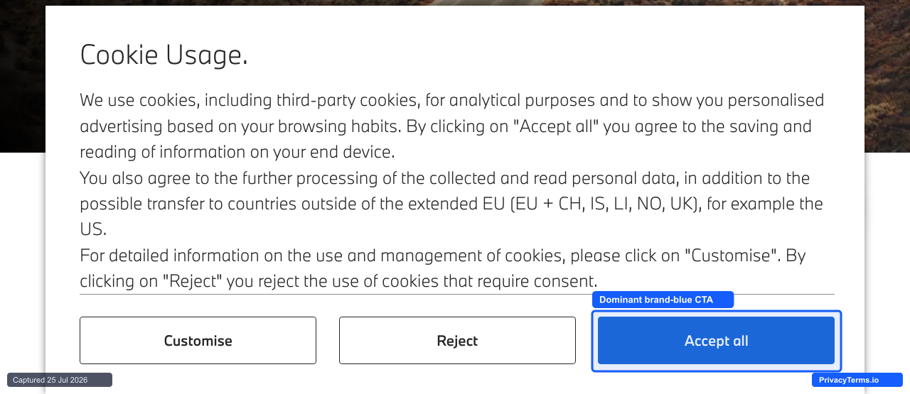
BMW's cookie banner, with a solid brand-blue "Accept all" set against two outline buttons
BMW reserves its signature blue for a single element on the entire panel: the “Accept all” button. “Customise” and “Reject” sit in the same row at the same size, styled as plain outline buttons, so the only thing pulling attention toward acceptance is fill color, not size or placement. That is a cleaner version of the pattern this section is named for than most sites manage, since reject still takes exactly one click rather than being shrunk or demoted to a text link.
24. Aldi
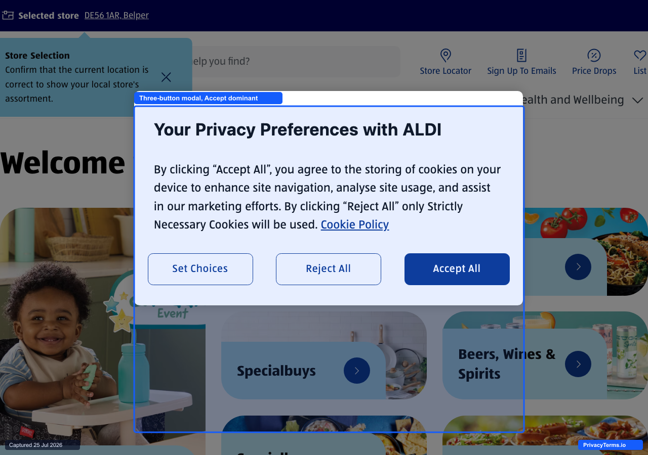
Aldi's three-button modal, titled "Your Privacy Preferences with ALDI"
Aldi’s modal is the exception in this section, a centered modal rather than a full-width bar, but it earns its place on the same CTA-hierarchy point: “Set Choices” and “Reject All” are styled as identical outline buttons, while “Accept All” is the only one filled in solid brand blue. The copy itself is compact, two sentences stating exactly what accepting and rejecting each do, with a linked “Cookie Policy” for anyone who wants more than that. It is a smaller, plainer version of the same one-directional weighting Puma and BMW show elsewhere in this section, just in modal form instead of a bar.
25. Just Eat
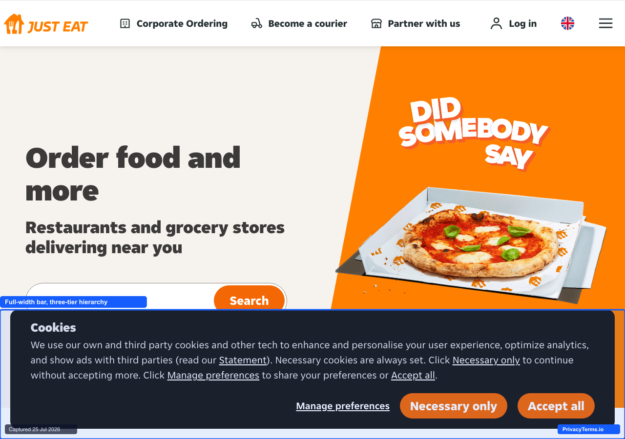
Just Eat's full-width bottom bar cookie banner, with three visually distinct button styles for manage, reject, and accept
Just Eat runs its cookie bar full-width across the bottom of the screen in the same black background and signature orange used throughout its ordering interface, rather than a generic CMP theme. The three actions are deliberately weighted rather than styled the same: “Manage preferences” appears as a plain underlined text link, “Necessary only” as a muted outlined button, and “Accept all” as a solid filled button in the brand’s core orange. Rejecting still takes exactly one click, so the hierarchy doesn’t cost the visitor extra steps, but the graduated styling makes the company’s preferred choice visually obvious, a middle ground between equal-weight buttons and a genuinely buried reject option.
Mobile-First Compact Patterns
Built primarily for small viewports, these banners prioritize vertical space and thumb-reachable buttons over the desktop-first layouts common elsewhere in this list.
26. Trainline

Trainline's mobile modal, with "Accept Cookies" and "Choose Cookies" stacked vertically
Trainline’s mobile modal stacks its two actions vertically rather than side by side: a full-width filled “Accept Cookies” button on top, a plain text-link “Choose Cookies” directly beneath it. That vertical stack keeps both tap targets at comfortable thumb width on a narrow screen instead of splitting the space into two cramped horizontal buttons, and demoting the granular option to a text link (rather than a second filled button) keeps the visual hierarchy clear without hiding it. The rest of the modal, a short two-paragraph explanation naming the 115-partner count, stays scrollable above the fold so the buttons never move once the page loads.
27. Wolt
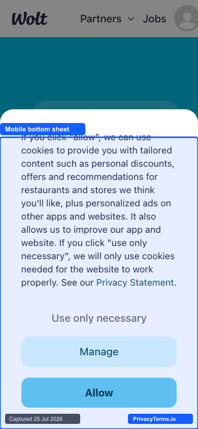
Wolt's mobile bottom sheet, with "Use only necessary" set as a plain text link above two full-width buttons
Wolt’s sheet rises from the bottom edge of the screen with a short paragraph naming personalized discounts and offers as the reason for asking, then resolves into “Manage” as an outlined button and “Allow” as a filled one, both full thumb-width. “Use only necessary” sits above both as plain gray text rather than a third button, the same demotion pattern Miro uses in the desktop section above, just carried onto mobile. It is a compact sheet, but the reject path still costs a visitor a moment of hunting for smaller, lower-contrast text instead of a same-size tap target.
28. eBay
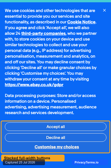
eBay's mobile cookie banner with three stacked full-width buttons
eBay’s mobile banner carries a genuinely long block of required text (the cookie notice, the 24 third-party companies named by count, a direct link to its GDPR page) but resolves the decision itself into three full-width buttons stacked vertically: “Accept all,” “Decline all,” and “Customise my choices” as an underlined link rather than a third button. None of the three is styled to visually outrank the others. That vertical stack is the actual mobile-first move here: rather than compressing three actions into a cramped horizontal row to save vertical space, eBay spends the vertical space it needs to keep every tap target full thumb-width, and pays for it by pushing the page content further down instead.
29. Deliveroo
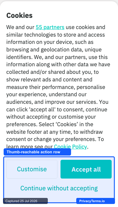
Deliveroo's bottom-sheet cookie banner anchored to the mobile screen edge
Deliveroo’s mobile banner rises as a rounded-corner sheet from the bottom edge of the screen rather than a top bar or a centered modal, a shape mobile visitors already recognize from native app share sheets and filters. The action row keeps “Accept all” as a filled teal button next to an outlined “Customise” option, with “Continue without accepting” set below as a plain text link, so reject is reachable but visibly less weighted than accept. Unlike Coursera’s or Medium’s copy, which is trimmed specifically to save vertical space, Deliveroo pairs its compact bottom-sheet shape with a full multi-sentence legal paragraph, so the sheet still ends up covering roughly four-fifths of the phone’s viewport when it first appears.
30. Boots
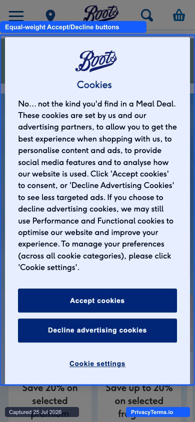
Boots' mobile modal, opening with "No... not the kind you'd find in a Meal Deal"
Boots leads with brand voice before it leads with legal language: “No… not the kind you’d find in a Meal Deal” sits above the actual cookie explanation, a small joke that still gets out of the way fast. “Accept cookies” and “Decline advertising cookies” are styled as identical solid navy buttons stacked full-width, with “Cookie settings” as a plain link beneath both for anyone who wants the granular view. It closes out this section’s mobile-first examples with the cleanest equal-weight accept/reject pairing of the three, proof that a playful opening line and a fair button hierarchy are not a tradeoff.
The Common Threads
Strip away the visual differences and the same five habits from the criteria list above show up in nearly every example: reject sits next to accept rather than behind it, the copy explains a concrete trade rather than reciting policy, toggles default off, the banner is styled to match the brand instead of the CMP vendor, and the whole interaction resolves in one step for the common case. None of that requires an elaborate build. It requires treating the banner as a real piece of product design rather than a compliance checkbox handled once and never revisited.
If you are building or rebuilding your own banner, start from the same five habits rather than copying any single example wholesale: a banner styled for one brand’s audience will not automatically fit a five-page brochure site, but the underlying decision structure travels. A cookie policy generated for your specific site is the other half of getting this right, since the banner only handles the interaction while the policy has to back up whatever the banner promised.
Frequently Asked Questions
Do I need a “Reject All” button, or is a settings link enough?
Under GDPR guidance from EU data protection authorities, rejecting must be no harder than accepting. A settings link that requires two or three additional clicks to reach an equivalent reject option is a common enforcement target, so a direct, one-click reject action next to accept is the safer baseline for any site with EU visitors.
Should cookie category toggles default to on or off?
Off, with the exception of strictly necessary cookies, which typically cannot be toggled at all because the site cannot function without them. A toggle that defaults to on and relies on the visitor to notice and switch it off is treated as opt-out, not opt-in consent, and does not meet GDPR’s consent standard.
Does a nicer-looking banner actually change how many people accept?
Design alone will not turn a banner asking for excessive tracking into one people want to accept, but a banner that is confusing, slow to load, or visually broken will suppress engagement regardless of what it is asking for. The examples above matter less for their visual polish than for removing friction from the decision itself, which is what actually moves the outcome.