Most privacy policies are written to survive a legal review, not to be read by an actual visitor deciding whether to trust a site with their data. The 15 pages below are different: each one comes from a company that had to solve the same problem, a genuinely long legal document that almost nobody wants to read in full, and each solved it with a different structural choice rather than a different font or color scheme. Some split the policy into tabs, some rewrote the opening paragraph in plain language, and some built an entire navigational hub around a document that used to just be one long page.
That distinction is the point of this roundup. A visitor who lands on a privacy policy is usually there for one of two reasons: checking whether a site can be trusted before handing over payment or account details, or looking for one specific answer, does this company sell my data, how long is it kept, who can I email about a deletion request. The pages that handle both cases well share a small set of structural habits, not a single template, which is why this list groups 15 real examples by the pattern they use rather than ranking them against each other.
What Makes a Privacy Policy Page Worth Copying
A handful of traits repeat across the pages below, independent of how long or short the underlying policy actually is:
- The plain-language answer comes before the legal text, not after it. A one-sentence summary of what the company actually does with data, stated up top, saves a visitor from reading the whole document just to find out.
- Long documents are broken into sections a visitor can jump to, whether that means a table of contents, an accordion, or a sidebar, rather than one continuous scroll with no way to skip ahead.
- Specialized topics get their own page instead of a buried clause, health data, children’s privacy, regional addenda, so a visitor with a narrow question is not asked to read past sections that do not apply to them.
- The page states what it cannot promise, not just what it can, an enterprise agreement that overrides the public text, a summary that is not the binding document, so a visitor is not misled by a friendlier layer sitting on top of the real policy.
- Currency is visible, an effective date or “last updated” stamp placed near the top rather than buried in a footer, so a returning visitor can tell at a glance whether anything has changed.
Keep those five in mind while reading through the examples. Where a page skips one anyway and still works, the entry below explains why.
Layered & Visual Privacy Hubs
These five treat the privacy policy as one destination inside a larger, visually structured hub rather than a single standalone document. Tabs, sidebars, and card grids do the organizing work that a plain wall of clauses would otherwise leave to the reader.
1. Apple
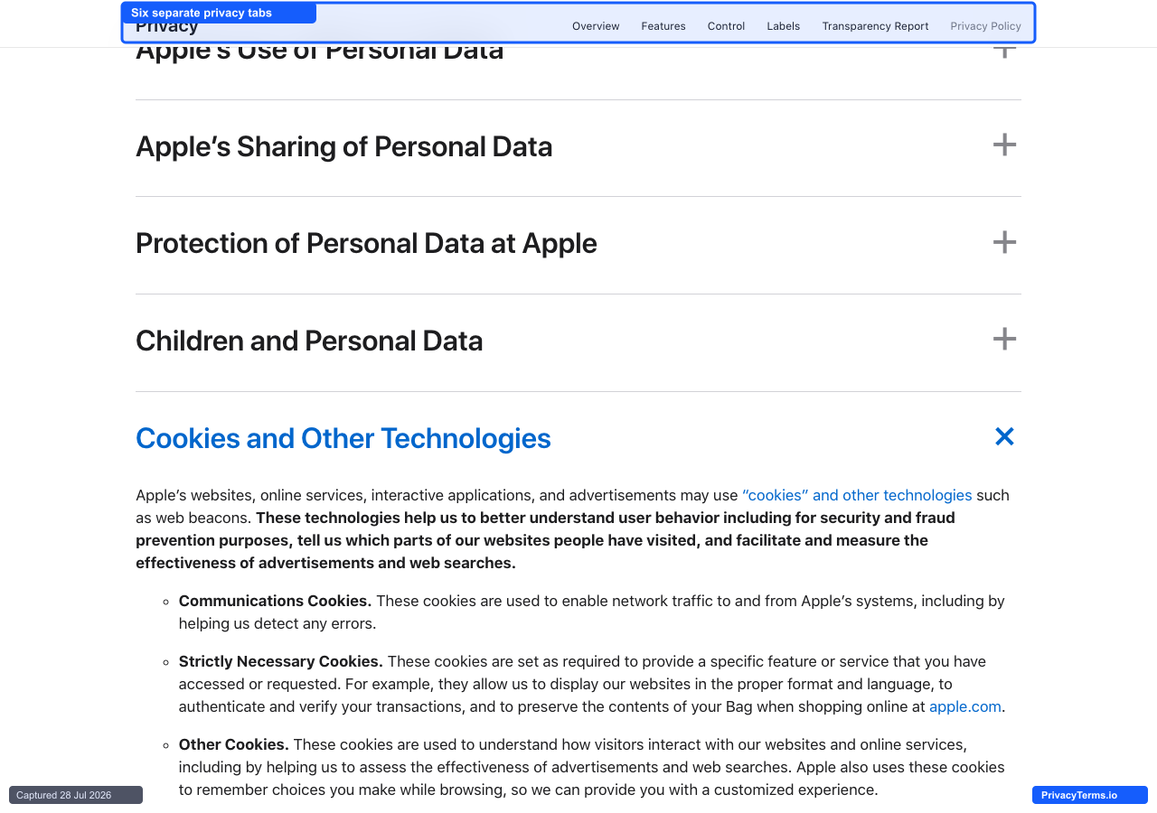
Apple's Privacy Policy page with six topic tabs and collapsible accordion sections
Apple splits its privacy policy across six separate top-level tabs, Overview, Features, Control, Labels, Transparency Report, and Privacy Policy, so a visitor lands on framing and controls before ever reaching the legal text itself. Inside the Privacy Policy tab, the document further breaks into collapsible accordion sections such as Apple’s Use of Personal Data, Apple’s Sharing of Personal Data, and Cookies and Other Technologies, each one collapsed by default and expanding in place rather than jumping to a separate page. That two-layer structure, tabs at the top and accordions underneath, keeps the page from reading as one long scroll of legal prose, and it lets someone who only cares about cookies open exactly that section without scanning past sharing and retention clauses first. The tradeoff is findability: a visitor looking for a specific clause has to first guess which of the six tabs holds it, since Control and Features carry plain-language explanations of settings rather than binding terms, and only the Privacy Policy tab has the accordion structure at all. For a company whose privacy messaging spans a hardware, software, and services ecosystem this large, splitting by audience intent before splitting by topic is a defensible design choice, even if it costs a first-time visitor an extra click to find the right tab.
2. Google
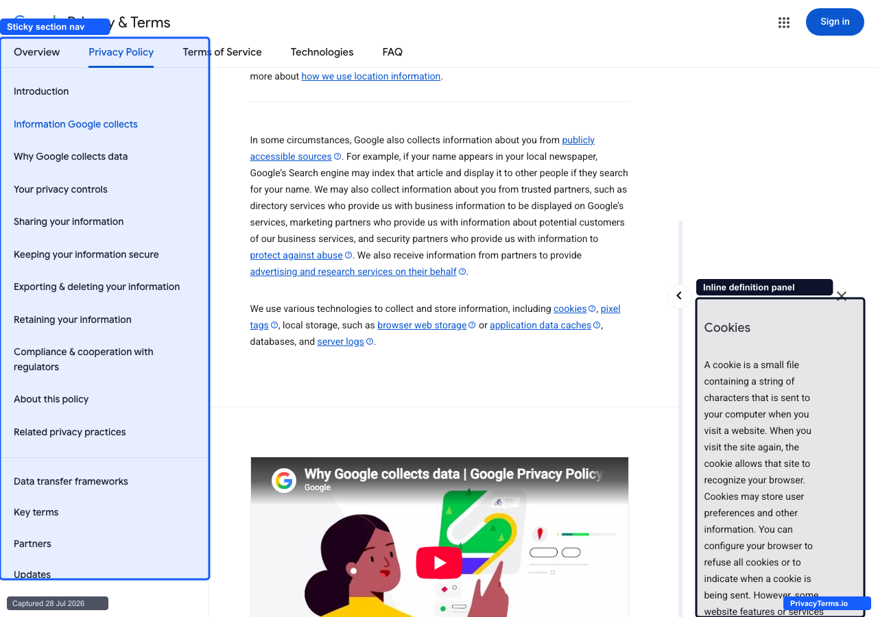
Google's Privacy Policy page with a sticky section nav and an inline cookie definition panel
Google’s privacy policy pairs a sticky left-hand table of contents, Introduction, Information Google collects, Why Google collects data, Your privacy controls, and a dozen more entries, with inline definition panels that slide out from the right edge of the page whenever a technical term like cookies or pixel tags appears as a link. Clicking cookies opens a panel that states plainly that “a cookie is a small file containing a string of characters that is sent to your computer when you visit a website,” without forcing a visitor to leave the paragraph they were reading or hunt down a separate glossary page. That combination, a persistent map of the whole document on one side and short glossary detours on the other, is what makes layered the right word for this page: a visitor can either read start to finish or jump straight to Sharing your information and never touch the rest. The real cost shows up on a narrower screen or a slower connection: the flyout panel is a genuinely separate UI layer that has to load and animate in, and it can visually crowd the main column on the exact browser widths where legal pages get the most drive-by traffic, embedded links inside emails and search results.
3. Spotify
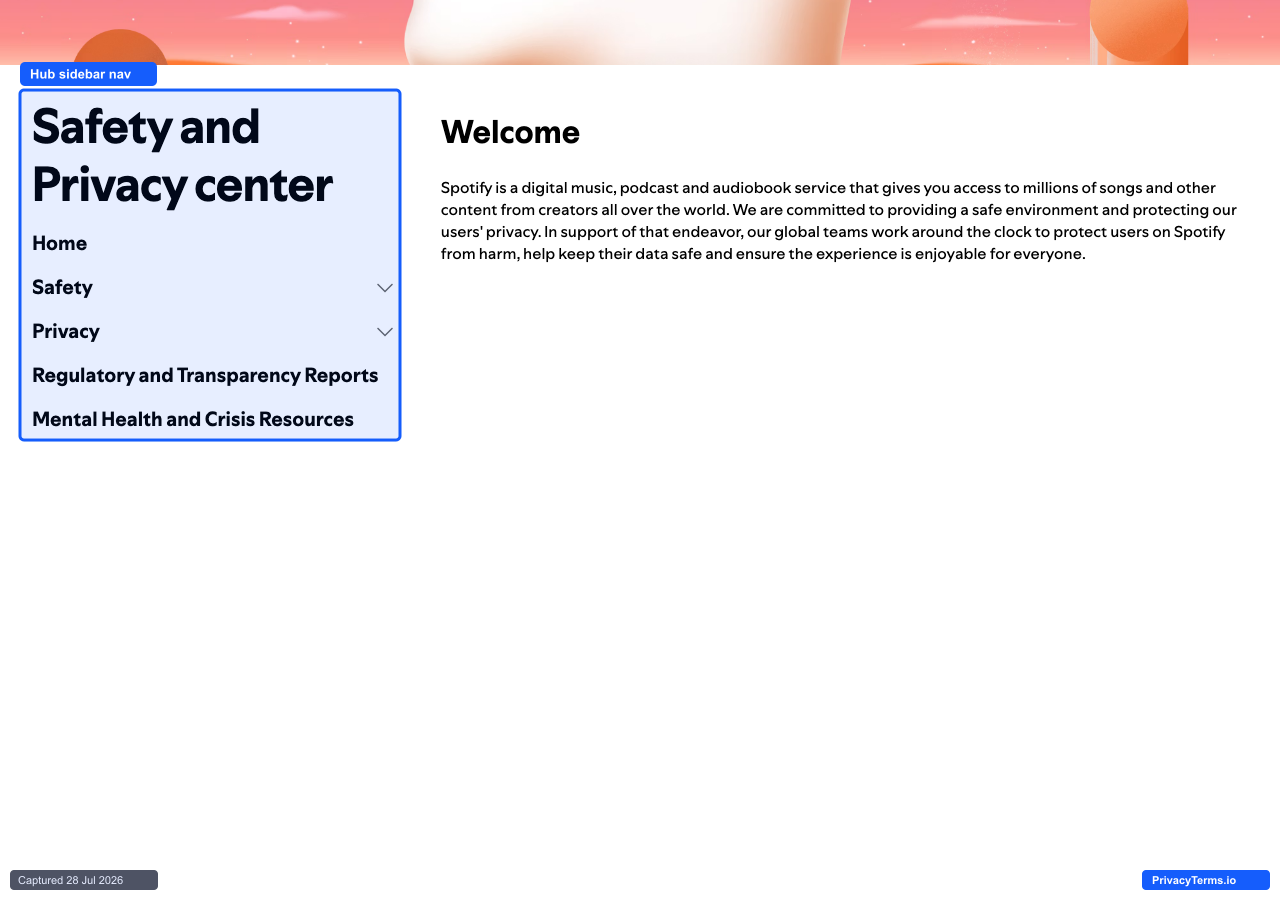
Spotify's Safety and Privacy center hub with an illustrated hero and sidebar navigation
Spotify runs its actual legal Privacy Policy as a plain numbered document, but sends visitors looking for a friendlier entry point to a separate Safety and Privacy center instead, opening on an illustrated hero and a persistent left sidebar listing Home, Safety, Privacy, Regulatory and Transparency Reports, and Mental Health and Crisis Resources, with Safety and Privacy each expanding into their own sub-menu of topics rather than a single long page. The welcome copy states plainly that Spotify is “committed to providing a safe environment and protecting our users’ privacy,” and frames the whole center around trust and safety topics together instead of treating privacy as a purely legal matter split off from content moderation and account security. That pairing is the detail worth copying: most companies keep safety and privacy as separate concerns handled by separate teams and separate pages, and Spotify’s hub treats them as one visitor journey. The limitation is that this hub does not replace the actual Privacy Policy, which still lives on its own numbered-clause page elsewhere on the site, so a visitor who needs the binding legal language, not just the plain-language overview, ends up needing both pages rather than one.
4. Canva
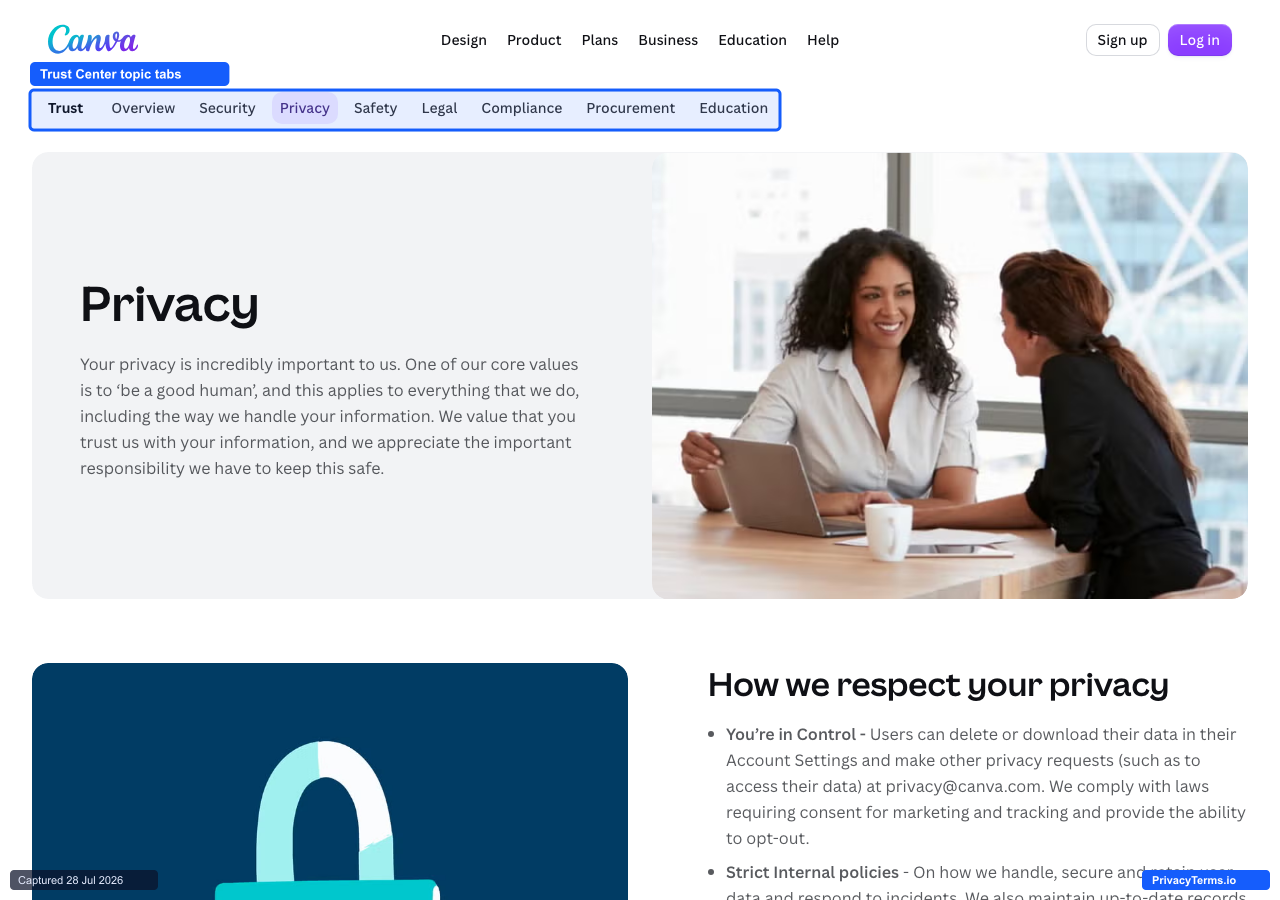
Canva's Trust Center Privacy tab with topic tabs for Security, Safety, Legal, and more
Canva’s Trust Center organizes its privacy information behind its own row of topic tabs, Overview, Security, Privacy, Safety, Legal, Compliance, Procurement, and Education, sitting below the regular site navigation so the page reads as its own small site rather than a single legal document with anchors. The Privacy tab opens with a plain statement of intent, “your privacy is incredibly important to us,” tied directly to a named company value, “be a good human,” before getting into any specifics about data deletion requests or consent requirements. Framing the policy around a value statement first, then backing it with the actual mechanics further down the page, gives the tab a tone closer to a product page than a compliance document, which fits a company whose whole pitch is approachability for non-designers. The tradeoff is that this page is a curated summary layer, not the enforceable policy itself; the actual Privacy Policy that governs a user’s account still lives on a separate, plainly numbered legal page elsewhere on canva.com, so a visitor who needs the binding text for a dispute or a specific clause has to leave this friendlier hub to find it.
5. Zoom
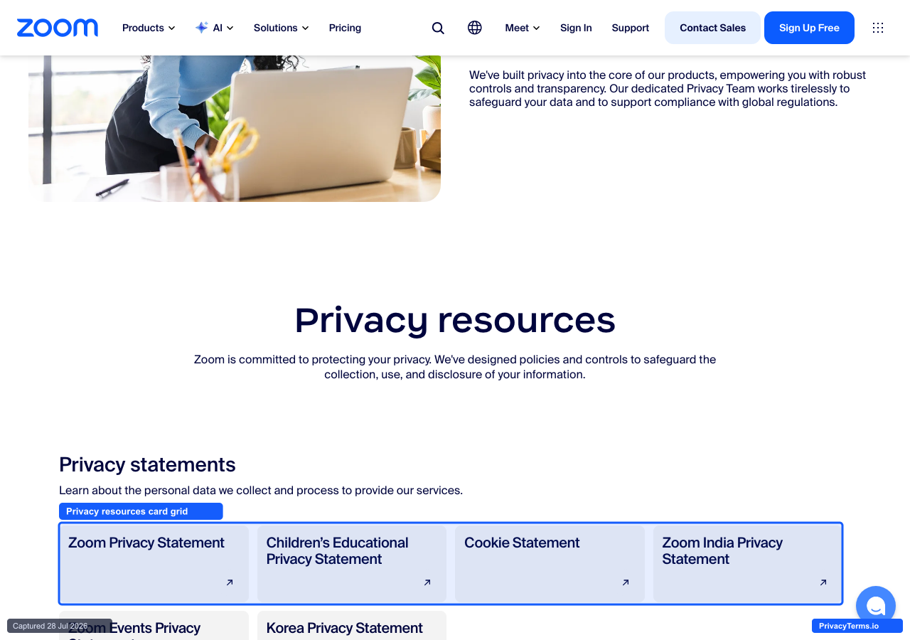
Zoom's Privacy resources card grid linking to separate statements by topic and region
Zoom’s privacy hub opens with a plain mission statement, “we’ve built privacy into the core of our products, empowering you with robust controls and transparency,” then resolves into a card grid under the heading Privacy resources rather than a single scrolling document: Zoom Privacy Statement, Children’s Educational Privacy Statement, Cookie Statement, and Zoom India Privacy Statement sit as separate clickable cards on the first screen, with further sections below splitting out GDPR addenda, regional infrastructure fact sheets, and product-specific data sheets in the same card pattern. That structure matches how Zoom’s actual privacy obligations work: a video platform selling into education, government, and dozens of national markets genuinely has different binding text for a school district in California than for an enterprise account in the EU, and a single merged document would either bury or oversimplify those differences. The real cost is volume: the full hub fans out into more than twenty separate cards across statements, addenda, and fact sheets, and a visitor who just wants “the privacy policy” has to correctly identify which one of them applies to their account before they are actually reading the right document.
Plain-Language Rewrites
These five all lead with a short, human-written summary before, or instead of, the dense legal document underneath. The summary is not a replacement for the binding text, but it answers the question most visitors actually came with.
6. Basecamp
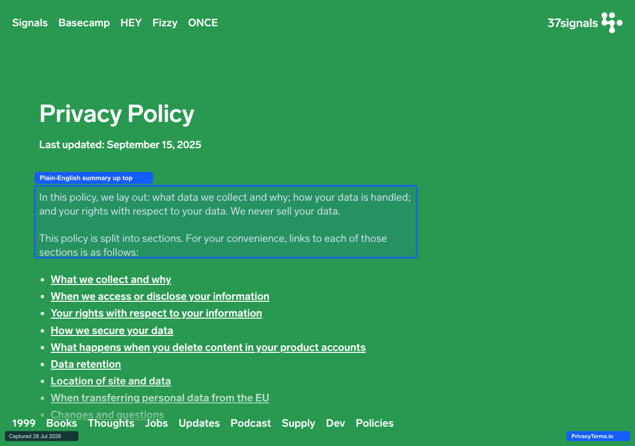
Basecamp's Privacy Policy page, with a plain-English summary paragraph above its jump-link table of contents
Basecamp’s privacy policy, written by 37signals, opens with a single unambiguous paragraph before any of the nine linked sections below it: “In this policy, we lay out: what data we collect and why; how your data is handled; and your rights with respect to your data. We never sell your data.” That sentence alone answers the two questions most visitors actually came to check, and only after stating it does the page hand off to a numbered jump-link table of contents (What we collect and why, How we secure your data, Data retention, and so on) instead of forcing a scroll through one undifferentiated wall of clauses. The jump links matter as much as the wording, since a visitor who only cares about data retention or EU transfers can click straight to that heading rather than reading nine sections to find the one that applies to them. The tradeoff is that the plain-language opener is still just a summary sitting on top of a genuinely long document; a visitor who needs the actual mechanics behind “how your data is handled” still has to open that section and read it, the top paragraph just makes the decision of which section to open a lot faster.
7. Mozilla (Firefox)
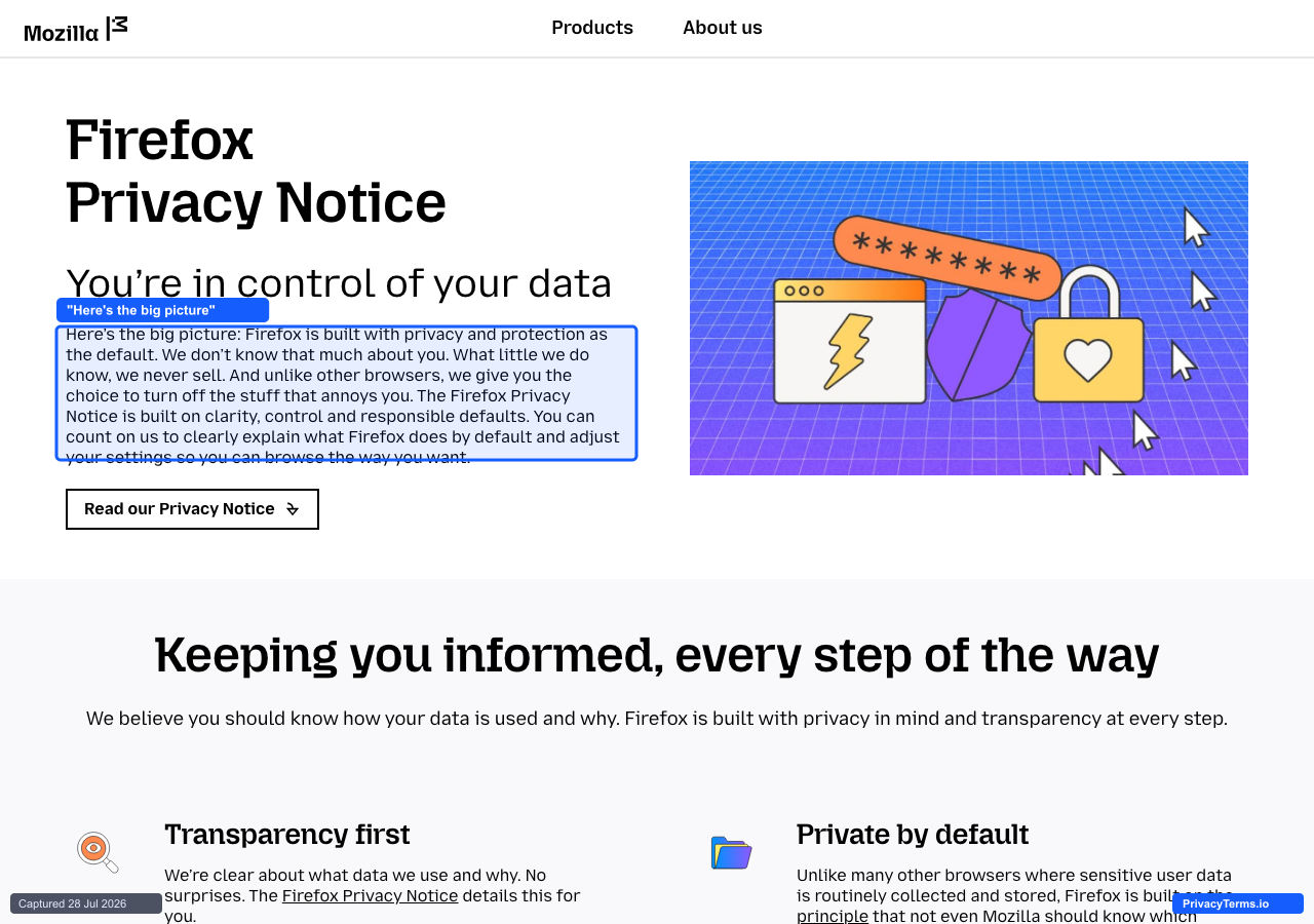
Mozilla's Firefox Privacy Notice landing page stating its "big picture" summary before linking to the full notice
Mozilla splits its Firefox privacy documentation into two layers instead of one: a plain-language landing page titled “Firefox Privacy Notice,” and the actual legal notice it links out to. The landing page opens with “Here’s the big picture: Firefox is built with privacy and protection as the default. We don’t know that much about you. What little we do know, we never sell,” written in first person and free of defined terms, before a single button, “Read our Privacy Notice,” hands off to the real document. That two-layer structure is a genuinely useful pattern for a browser whose privacy reputation matters to people who will never read a full legal notice: the landing page gives them an honest, quotable answer in four short sentences without requiring the click-through. The limitation is that the landing page is not the policy itself, just a summary of it, so a visitor who needs the specifics that actually govern Mozilla’s data handling, retention windows, named processors, what “responsible defaults” means in practice, still has to leave this page and read the linked notice underneath it.
8. DuckDuckGo
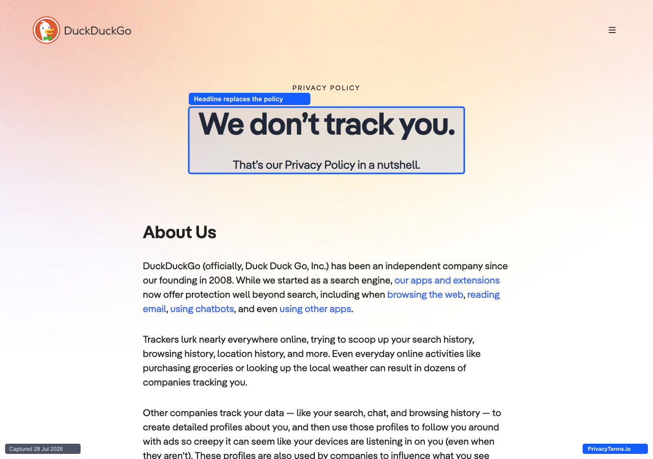
DuckDuckGo's Privacy Policy page opening with the headline "We don't track you."
DuckDuckGo’s privacy policy leads with a headline instead of a definitions section: “We don’t track you.” set in the largest type on the page, followed immediately by “That’s our Privacy Policy in a nutshell.” Only after that two-line summary does the page move into an “About Us” section and the longer explanation of how trackers “scoop up your search history, browsing history, location history, and more.” Putting the conclusion before the argument is an unusually direct move for a legal document, and it works here because the underlying claim is simple enough to survive being compressed into five words without becoming misleading. The tradeoff is that “in a nutshell” undersells how much the company now covers: DuckDuckGo has grown from a search engine into apps, chatbots, and an email service, and paid subscription tiers each carry their own separate privacy and terms pages elsewhere on the site, so a visitor who reads only this headline and this page gets an accurate answer for search but not necessarily for every product with the DuckDuckGo name on it.
9. Headspace
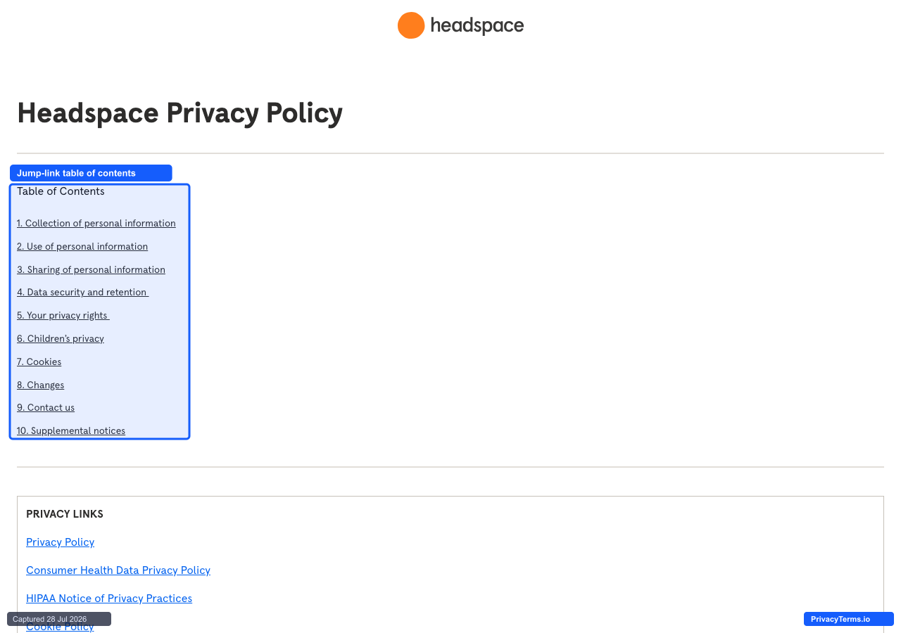
Headspace's Privacy Policy page with its numbered, jump-link table of contents
Headspace’s privacy policy places a ten-item, numbered “Table of Contents” directly beneath the page’s single heading, each entry a jump link (1. Collection of personal information, 5. Your privacy rights, 6. Children’s privacy) rather than requiring a scroll to find the relevant clause. Below that list sits a separate “Privacy Links” box pointing to distinct documents: a “Consumer Health Data Privacy Policy” and a “HIPAA Notice of Privacy Practices,” kept apart from the main policy rather than folded into it. Numbering the sections and linking straight to them is a small but real usability win on a policy this long, and splitting out health-specific disclosures as their own document is honest about the fact that a meditation app collects a materially more sensitive category of data than a typical consumer service. The tradeoff is exactly that separation: a visitor who reads only the main Privacy Policy and stops there, reasonably assuming a numbered table of contents covers everything relevant, will not encounter the health-data-specific commitments unless they notice and click through to that second document.
10. Signal
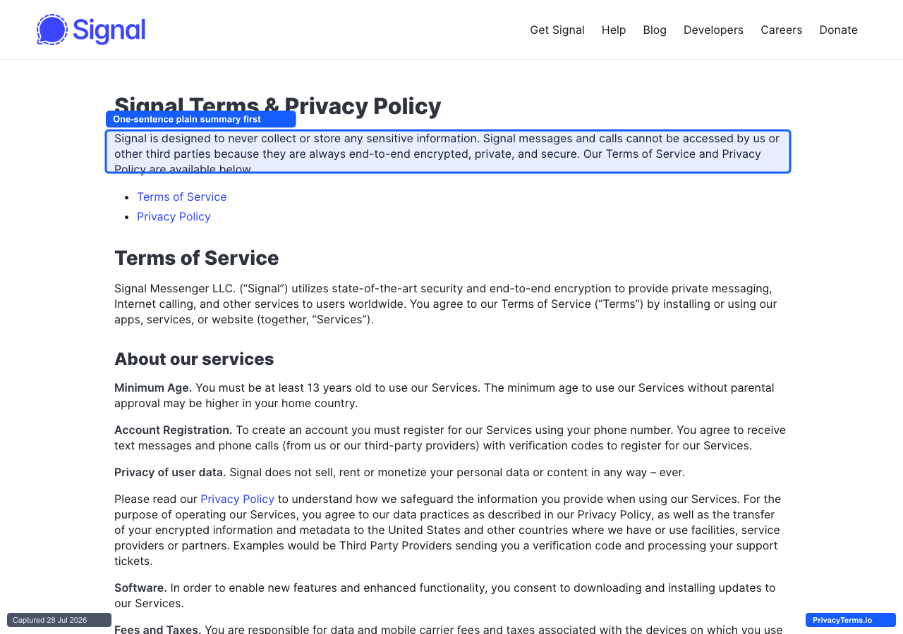
Signal's combined Terms & Privacy Policy page opening with a one-sentence plain-language summary
Signal combines its Terms of Service and Privacy Policy into one page, titled plainly “Signal Terms & Privacy Policy,” and opens with a single paragraph before either section begins: “Signal is designed to never collect or store any sensitive information. Signal messages and calls cannot be accessed by us or other third parties because they are always end-to-end encrypted, private, and secure.” That sentence functions as a plain-language abstract sitting above two bullet links, “Terms of Service” and “Privacy Policy,” that jump to the fuller sections below on the same page. For a messaging app whose entire value proposition is not being able to read your messages, stating that claim in one sentence before any legal structure appears is the correct ordering: the thing people actually want to know comes first. The tradeoff is combining the two documents on one page rather than two: a visitor looking specifically for privacy-relevant clauses, data retention, phone number handling, has to scroll past account-registration and software-update terms that belong to the Terms of Service half, rather than landing on a page that is only about privacy.
Developer-Facing & Granular Control Centers
The last five treat the privacy policy as one entry point into a larger set of legal and compliance documents, sidebars, tab bars, and linked sub-pages built for a technical or procurement audience that needs to cite a specific document, not just read a general assurance.
11. Stripe
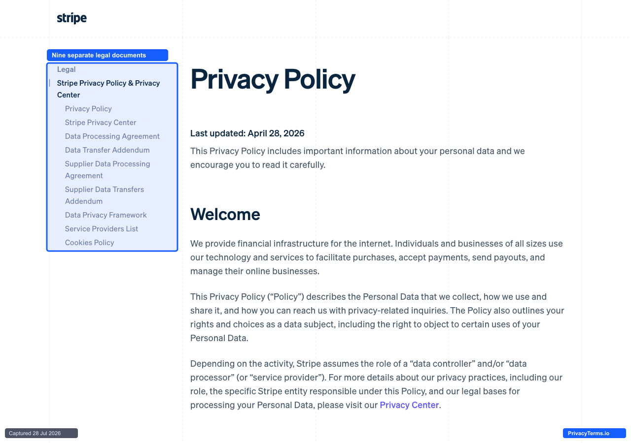
Stripe's Privacy Policy page with a sidebar listing nine separate linked legal documents
Stripe’s Privacy Policy page is really the entry point to a dedicated legal sidebar rather than a single document: the left rail lists nine distinct destinations, Privacy Policy, Stripe Privacy Center, Data Processing Agreement, Data Transfer Addendum, Supplier Data Processing Agreement, Supplier Data Transfers Addendum, Data Privacy Framework, Service Providers List, and Cookies Policy, each its own standalone page rather than an anchor jump inside one long scroll. The inclusion of a standing “Service Providers List” as its own linked document, updated independently of the policy text around it, is the detail worth copying for any company selling to technical buyers: a developer or procurement reviewer evaluating a subprocessor list does not have to search a wall of prose for a table that changes on its own schedule. The tradeoff is real, though: splitting governance across nine separate pages means a first-time visitor has to already know which document answers their specific question, since the landing page just names the categories rather than summarizing what changed between them, a cost a simpler single-page policy would not impose.
12. Slack
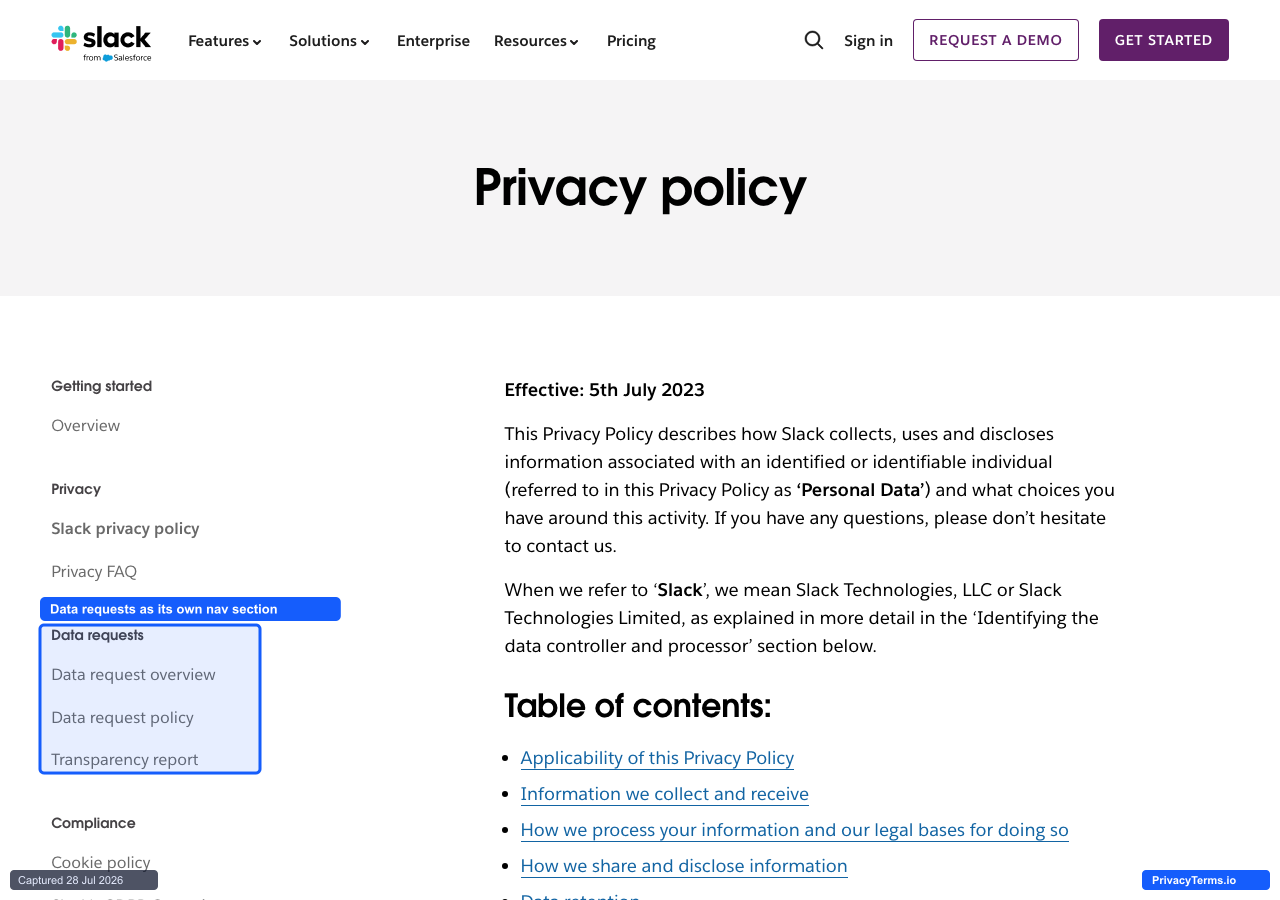
Slack's privacy policy page with a left-nav "Data requests" section separate from the policy text
Slack’s privacy policy page sits inside a left-hand navigation that treats compliance operations as separate destinations rather than sections of one document: a “Data requests” heading holds its own “Data request overview,” “Data request policy,” and “Transparency report” links, sitting apart from the “Privacy” heading that holds the policy text itself. That separation is a genuinely useful choice for an admin or in-house counsel evaluating Slack for a regulated team, since a published transparency report and a standalone data request policy are exactly the artifacts a security review checklist asks for by name, and burying them as anchors inside the main policy would make them harder to cite in that review. The page backs this with an in-page “Table of contents” once a reader is inside the policy itself, so both levels stay skimmable. The gap is that none of this granularity is visible from Slack’s homepage or footer without already knowing to look for a “Trust” section, so a casual visitor evaluating the product on its privacy practices alone needs several extra clicks past pricing and features to find any of it.
13. GitHub
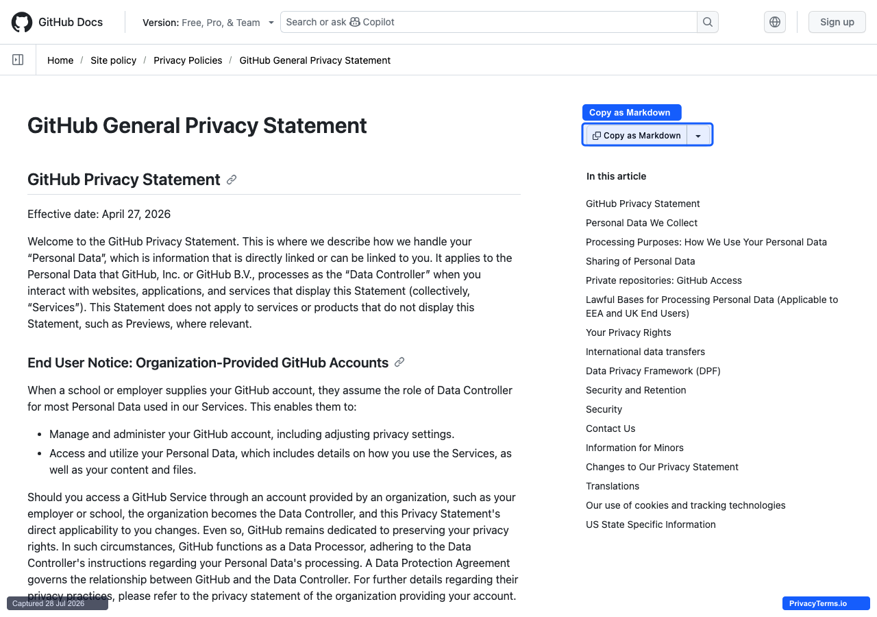
GitHub's General Privacy Statement rendered in its docs shell with a "Copy as Markdown" button
GitHub’s General Privacy Statement lives inside its documentation site rather than a marketing-styled legal page, and it borrows the same navigation developers already use for API references: a breadcrumb trail (Home / Site policy / Privacy Policies), a right-hand “In this article” jump list with roughly seventeen anchors, and, unusually for a privacy document, a “Copy as Markdown” button sitting directly above the heading. That last detail is the one worth studying: treating a privacy statement as something a developer might paste into an editor, a wiki, or an internal tool, rather than only ever read on-screen, is a level of respect for a technical audience’s actual workflow that almost no other company in this list extends to its policy page. Sections like “Private repositories: GitHub Access” read like product documentation for the same reason, not boilerplate legal language. The tradeoff is tone: presenting a privacy statement inside a docs shell makes it easier to navigate but reads more like a technical manual than a plain-language explanation to a non-developer visitor who lands there by accident, say from a footer link.
14. Figma
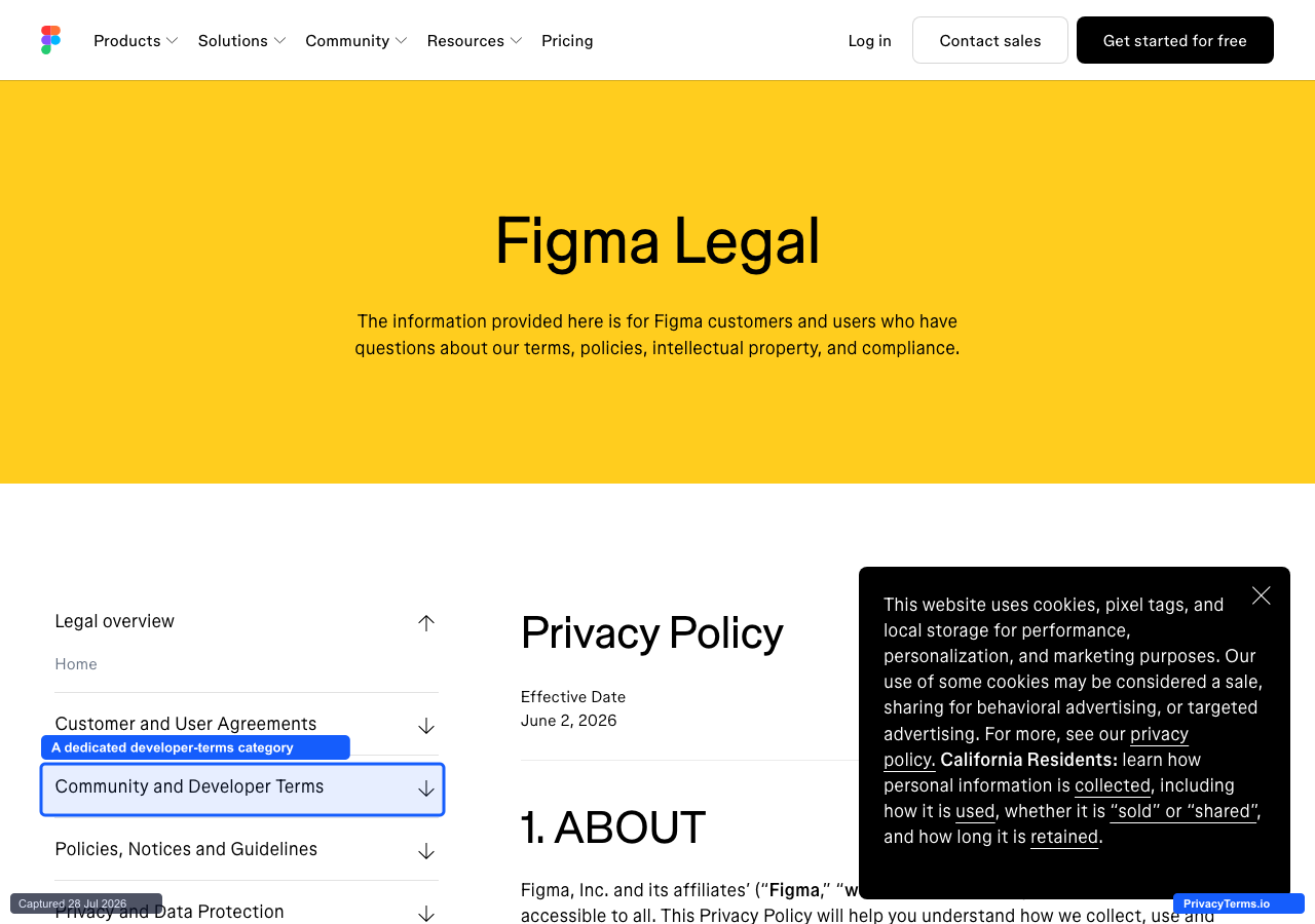
Figma's Legal hub with a nested sidebar naming a dedicated "Community and Developer Terms" category
Figma’s privacy policy lives inside a “Figma Legal” hub with a nested sidebar that groups every legal document into four labeled categories, Customer and User Agreements, Community and Developer Terms, Policies, Notices and Guidelines, and Privacy and Data Protection, each expandable into its own set of linked pages rather than one flat list. Giving developer-facing terms their own named category, separate from the customer agreements most companies would fold it into, matches how a design and prototyping tool actually gets used: plugin authors, API integrators, and community file publishers carry different obligations than a paying seat-holder, and the navigation reflects that instead of forcing all three into one terms-of-service document. The specific “Effective Date” stamp sits directly under the page’s own heading rather than buried in a footer, so a reader can confirm currency before reading further. The real limitation on this capture is a cookie-consent modal that opens on load and sits over part of the page; it does not cover the sidebar or the policy heading, but it is a reminder that even a well-organized legal hub still routes every visitor through the same disclosure interruption first.
15. Dropbox
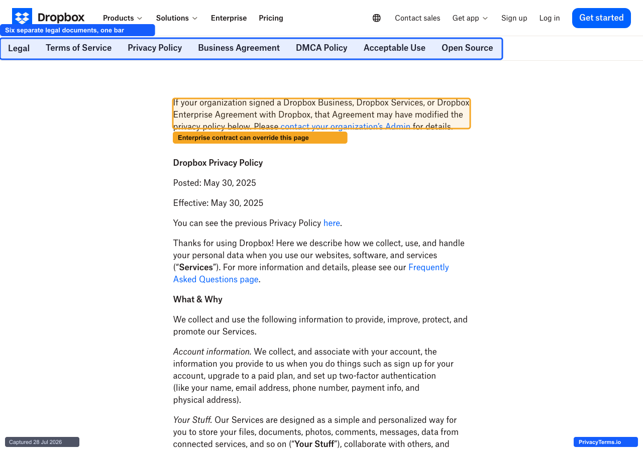
Dropbox's privacy policy page with a horizontal legal tab bar and an enterprise-agreement override notice
Dropbox’s privacy policy page opens with a horizontal legal tab bar, Terms of Service, Privacy Policy, Business Agreement, DMCA Policy, Acceptable Use, and Open Source, treating each as an equal peer rather than nesting the business-facing documents under the consumer ones. Directly above the policy text itself, a callout states plainly that “if your organization signed a Dropbox Business, Dropbox Services, or Dropbox Enterprise Agreement with Dropbox, that Agreement may have modified the privacy policy below,” and tells an admin to check with their organization rather than assume the public page is the operative document. That is a rare and honest admission for a public legal page to make: the policy in front of you might not be the one actually governing your account, and Dropbox says so before asking anyone to keep reading, instead of leaving an enterprise customer to discover the conflict later during a dispute. The tradeoff is that the callout does not say which specific terms an enterprise agreement is likely to override, so a customer admin still has to track down and read their own contract to find out.
The Common Threads
Strip away whether a page uses tabs, sidebars, accordions, or card grids, and the same handful of habits show up across all fifteen: a plain-language answer sits above or alongside the legal text rather than replacing it, long documents are broken into pieces a visitor can jump to instead of one continuous scroll, specialized topics, health data, children’s privacy, enterprise overrides, get their own clearly linked page rather than a buried clause, and an effective date or “last updated” stamp sits near the top rather than in a footer nobody scrolls to. None of that requires rewriting the underlying legal language; it requires organizing it so a visitor with one specific question can find the answer without reading the whole document first. A privacy policy generated for your specific site starts from the same idea: the clauses have to be accurate for your actual data practices, but nothing stops the page around them from being just as navigable as the best examples above.
Frequently Asked Questions
Does a privacy policy need a plain-language summary, or is the legal text enough?
The legal text is what actually governs a dispute, but a plain-language summary above it is what most visitors read before deciding whether to trust the site at all. Several examples above, DuckDuckGo and Mozilla in particular, show that a short, honest summary does not weaken the binding document underneath it; it just gives a visitor an accurate answer without requiring them to parse defined terms first.
Should a company split its privacy policy into multiple pages, or keep everything on one?
It depends on how varied the underlying data practices actually are. A company handling one product for one audience, like Signal or DuckDuckGo, can keep everything on a single page without losing clarity. A company with genuinely different obligations by region, product, or customer type, like Zoom or Stripe, is better served by splitting those differences into separate, clearly labeled documents rather than merging them into one page that either oversimplifies or buries the distinctions.
Is a “Last updated” or “Effective date” stamp actually necessary on a privacy policy?
Yes, and it should be visible near the top rather than only in a footer. A returning visitor, or a regulator reviewing the page during an investigation, needs to know whether the version in front of them is current without cross-referencing a separate changelog. Several of the pages above, Figma among them, place the effective date directly under the page’s own heading for exactly this reason.